
The Psychology of Rug Colour: Why Luxury Homes Keep Choosing These 5 Palettes

Ever notice luxury hotels and Instagram-famous homes seem to have similar rug colours? Here’s why—and how to use them in your own space.
Walk into a luxury hotel suite, a beautifully photographed designer home or a sophisticated living room on Instagram, and you'll often notice something interesting.
The interiors may look completely different, but the rug colours tend to follow a surprisingly familiar formula.
Warm greys. Deep navy. Soft beige. Sage green. Ivory. Black and white. Muted blush. Occasional mustard or terracotta.
This isn't accidental.
Colour is one of the most powerful tools in interior design. It influences how spacious, intimate, calm, warm or dramatic a room feels. And because a large area rug occupies such a significant portion of the floor, its colour can influence the mood of an entire space.
At Imperial Knots, our approach to colour begins with the same principle: a rug should complement the architecture and personality of a space rather than simply follow a trend. Our handmade rugs are crafted in Bhadohi, India's historic carpet-making region, where colour, yarn and craftsmanship come together to create rugs with depth and character.
So, which rug colours are designers repeatedly choosing—and why?
Here are five of the most powerful palettes to consider in 2026.
Why Rug Colour Has Such a Powerful Effect on a Room
Colour psychology isn't as simple as saying that blue always makes you calm or yellow always makes you happy.
Our response to colour depends on several factors, including saturation, brightness, surrounding colours, natural light, materials and personal associations.
However, colour does influence how we perceive an interior.
Cooler colours can create a feeling of calm and visual spaciousness. Darker, saturated colours can add depth and intimacy. Warm neutrals can make a room feel comfortable and sophisticated, while natural greens can create a connection with the outdoors.
A rug amplifies this effect because it is usually one of the largest decorative surfaces in a room.
Consider a large navy rug in a living room. The navy immediately creates visual depth. Replace it with a pale ivory rug and the same room can suddenly feel lighter and more open. Introduce beige and sage green, and the atmosphere becomes softer and more organic.
This is why choosing rug colour combinations should be treated as an important design decision rather than an afterthought.
For rooms where the rug is intended to set the overall atmosphere, explore our Living Room Rugs.
The 5 Power Palettes Luxury Designers Keep Coming Back To
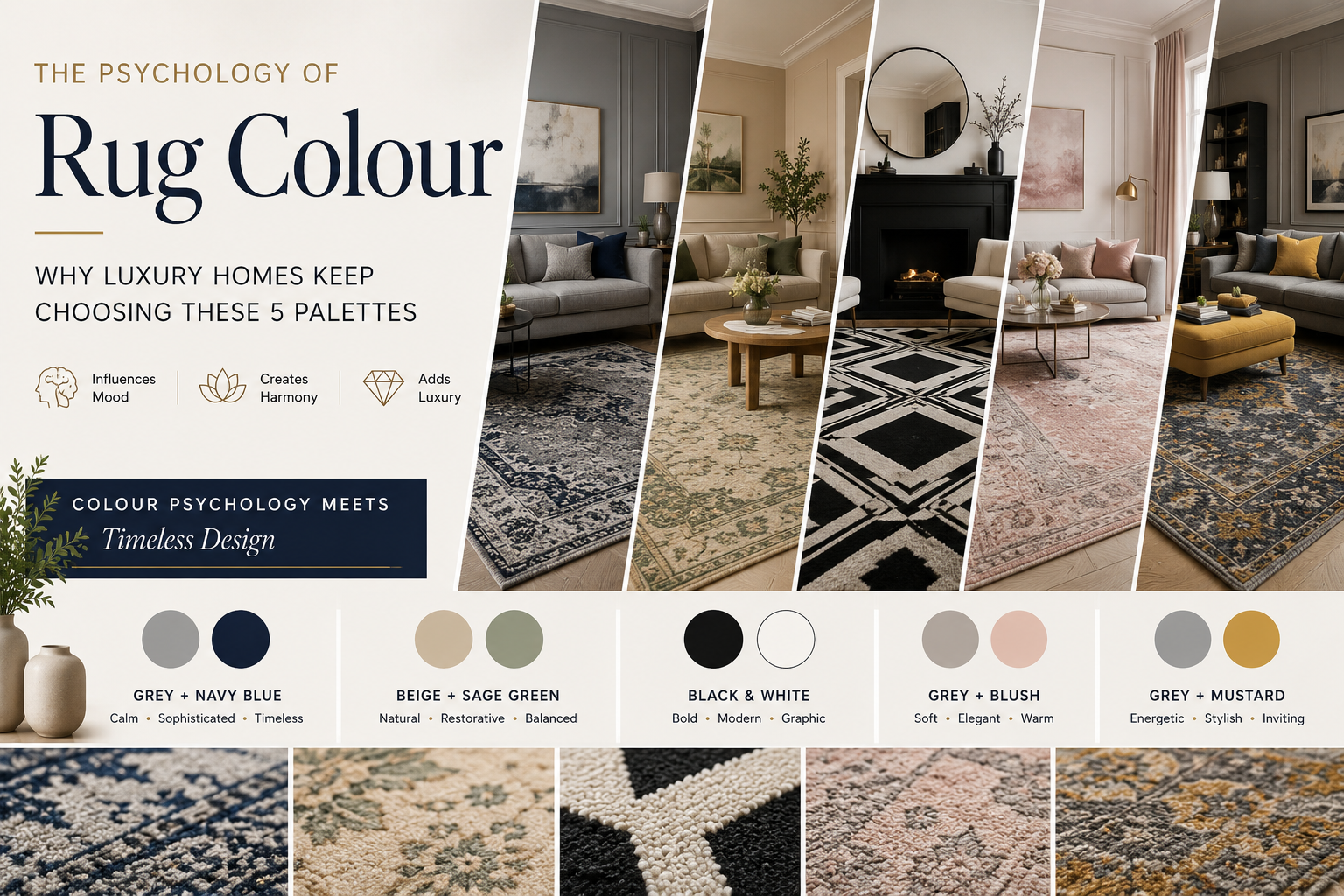
1. Grey + Navy Blue: Calm, Confident and Timeless
Few combinations are as effortlessly sophisticated as grey and navy blue.
Grey creates a neutral foundation. Navy introduces depth and personality.
Together, they create a room that feels polished without looking overly formal.
This palette works particularly well in contemporary living rooms where the furniture is neutral—think grey, cream, ivory or beige sofas—with navy introduced through the rug, cushions, artwork or occasional furniture.
Why Grey and Navy Work Together
Grey is visually restrained. It allows architectural features and furniture to remain important without competing for attention.
Navy is more expressive, but considerably softer than pure black. It brings a sense of depth and richness to a space.
The result is a palette that feels:
- Calm
- Sophisticated
- Confident
- Timeless
- Contemporary
For a classic luxury look, combine a grey and navy rug with walnut furniture, warm white walls, cream upholstery and aged brass.
Explore Grey Rugs for understated foundations, or add depth with our Blue Carpets & Rugs.
Try This Grey + Navy Combination
Grey sofa + grey/navy rug + walnut coffee table + ivory walls + brass lighting
The key is contrast. If every element is grey, the room can feel flat. Navy gives the eye a deeper colour to anchor itself to.
2. Beige + Sage Green: The New Quiet Luxury
If grey and navy represent urban sophistication, beige and sage green represent modern quiet luxury.
This combination has become increasingly popular as interior design moves toward natural materials, softer shapes and colours inspired by nature.
Beige provides warmth and neutrality.
Sage green introduces colour without overwhelming the room.
Together, they create an environment that feels relaxed, sophisticated and connected to nature.
This palette works beautifully with natural oak, travertine, linen, bouclé, cane, rattan, light walnut and aged brass.
Why Beige and Sage Green Work
Green is strongly associated with nature, renewal and balance. Sage is particularly versatile because its muted saturation makes it easy to live with.
Beige adds warmth and familiarity.
This makes a beige and sage green rug particularly suitable for bedrooms, reading rooms, relaxed living spaces and homes designed around natural textures.
Explore our Beige Carpets & Rugs as a neutral starting point, then introduce sage through the rug pattern, cushions, curtains or plants.
Designer Formula
Beige rug + sage accents + oatmeal sofa + pale timber + warm white walls
The result is understated luxury rather than obvious opulence.
3. Black + White: Graphic, Bold and Architectural
Some combinations never really disappear from interior design.
Black and white is one of them.
The reason is contrast.
A black-and-white rug can immediately give a room a more architectural and intentional appearance. Geometric patterns become especially powerful because the limited colour palette directs attention toward shape, proportion and line.
This palette works beautifully in contemporary apartments, minimalist homes, modern offices, design studios, statement living rooms and luxury bedrooms.
The Psychology of Black and White
Black creates visual weight and drama.
White creates openness and light.
Together, they create structure.
But there is an important rule: don't let the entire room become stark.
Introduce warmth through walnut, oak, textured upholstery, artwork, plants or aged metals.
For example:
Black-and-white rug + cream sofa + walnut coffee table + warm white walls
will generally feel more inviting than:
Black-and-white rug + white sofa + white walls + black furniture.
For contemporary interiors, explore our Hand-Tufted Rugs.
4. Grey + Blush: Soft Luxury With a Contemporary Edge
Pink has changed dramatically in interior design.
Instead of bright or highly saturated pinks, contemporary interiors increasingly use dusty blush, muted rose and soft pink as sophisticated accent colours.
Pairing blush with grey creates an elegant combination that feels warm without becoming overly feminine.
Grey gives blush structure.
Blush gives grey warmth.
Where Grey + Blush Works Best
- Bedrooms
- Guest rooms
- Dressing areas
- Reading corners
- Boutique-style living rooms
- Intimate seating areas
A grey rug with subtle blush detailing can create a much more sophisticated effect than a predominantly pink rug.
Think:
Warm grey rug + dusty blush pattern + cream sofa + dark wood + brass
The blush becomes an accent rather than the entire story.
5. Grey + Mustard: A Sophisticated Burst of Personality
For homeowners who want a little more energy, grey and mustard is a particularly effective combination.
Grey creates the neutral foundation.
Mustard introduces warmth, energy and personality.
The secret is proportion.
Why Mustard Works With Grey
Bright yellow can sometimes feel overwhelming in a large interior.
Mustard is different.
Its slightly muted and earthy character makes it more sophisticated and easier to combine with natural materials.
It works particularly well in living rooms, dining rooms, entryways, home offices and reading spaces.
The Grey + Mustard Formula
Grey rug + mustard accent chair + cream walls + walnut furniture
The result is energetic without becoming loud.
Bonus Palette: Navy + Beige
While the five palettes above cover some of the strongest contemporary combinations, there is one classic pairing that deserves special attention:
Navy + beige.
It is one of the easiest ways to create an elegant, timeless interior.
Beige brings warmth.
Navy brings depth.
Depending on the pattern and furniture, the same colour combination can feel coastal, contemporary, traditional or formal.
Contemporary Navy + Beige
Navy geometric rug + beige sofa + walnut table + ivory walls
Traditional Navy + Beige
Navy patterned rug + beige upholstery + dark wood + brass lighting
For inspiration, browse our Blue Carpets & Rugs.
The Colour You See Isn't Just About Dye
When choosing a handmade rug, it's important to understand that colour isn't simply a number on a digital colour chart.
The final appearance of a rug depends on several elements:
- Fibre
- Yarn
- Dye
- Knot or weaving technique
- Pile height
- Surface texture
- Density
- Natural and artificial lighting
A navy wool rug and a silk-blend navy rug can therefore look completely different, even if both are technically described as “navy blue”.
The same is true for neutrals.
A beige rug can lean toward sand, taupe, camel, cream or stone.
Grey can lean toward silver, charcoal, blue-grey or warm greige.
These subtle variations are part of what gives a handmade carpet its character.
From Yarn to Rug: The Bhadohi Craft Behind the Colour
At Imperial Knots, our rugs are made in Bhadohi, one of India's historic carpet-making centres.
Here, carpet-making is not simply an industrial process. It is a craft built around generations of artisan knowledge.
Selecting Fibres and Preparing Yarn
Fibres are selected and yarn is prepared according to the desired texture, construction and finish.
Dyeing and Colour Development
Dyeing is equally important.
The way yarn absorbs colour influences how the finished rug interacts with natural and artificial light.
Construction Creates Depth
Construction determines how the surface catches light and how colours appear across the pile.
This is particularly noticeable in handmade rugs.
A rug can appear slightly different depending on whether you look at it from one direction or another.
If you want to understand the difference between handcrafted and mass-produced construction, read our guide to Handmade Carpets vs Machine-Made Carpets.
How to Match Rug Colour With Your Sofa and Walls
Choosing a rug colour becomes much easier when you stop thinking about the rug separately from the room.
Instead, look at the entire palette.
If Your Sofa Is Grey
Try:
- Navy + grey
- Grey + blush
- Grey + mustard
- Grey + ivory
- Grey + beige
Explore Grey Rugs for different tones and patterns.
If Your Sofa Is Beige
Try:
- Beige + sage
- Navy + beige
- Grey + beige
- Black + ivory
A slightly darker rug can prevent a beige room from becoming visually flat.
If Your Walls Are White
You have almost unlimited options.
Deep navy, black and white, mustard accents or richly patterned handmade rugs can all work beautifully.
For a softer approach, browse White & Ivory Rugs.
If Your Walls Are Dark
Look for rugs containing lighter tones to create balance.
For example:
Navy walls + beige rug + ivory sofa
or
Charcoal walls + ivory/grey rug + warm wood
can create the intimate atmosphere of a boutique hotel.
The 60–30–10 Rule for Rug Colour
One of the easiest ways to understand colour balance is the classic 60–30–10 rule.
60% — Dominant Colour
Walls, large furniture and architectural elements.
30% — Secondary Colour
Rug, curtains, accent furniture and larger textiles.
10% — Accent Colour
Cushions, artwork, accessories and decorative objects.
Your rug doesn't have to occupy the 30%.
But because an area rug is often one of the largest decorative elements in a room, it can act as the bridge between the dominant and accent colours.
Rug Colour Trends to Watch in 2026
The biggest rug colour trend for 2026 isn't a single colour.
It is more nuanced colour.
After years of extremely pale and neutral interiors, designers are increasingly bringing earthy and saturated colours back into homes—but using them with restraint.
Earthy Neutrals
Taupe, sand, beige, camel and warm grey are increasingly important as foundations for sophisticated interiors.
Deep Blues
Navy and indigo offer homeowners a way to introduce strong colour without creating an interior that feels temporary.
Nature-Inspired Greens
Sage, olive and moss work particularly well with timber, stone, linen and other natural materials.
Warm Accent Colours
Mustard, rust, terracotta and muted reds can add personality to neutral interiors.
Tonal Rugs
Instead of dramatic contrast, tonal rugs use several shades of a similar colour to create depth.
The overall direction is clear:
Earthy + sophisticated + saturated, rather than bright + artificial + heavily contrasted.
Customer Case Study: “She Wanted Her Home to Feel Like a Luxury Hotel”
One of the most interesting requests in luxury interior design is also one of the simplest:
“I want my home to feel like a luxury hotel.”
For one such design brief, the solution wasn't to fill the room with expensive furniture.
It started with the rug.
The room already had neutral furniture, warm off-white walls, natural wood and subtle brass accents.
The homeowner wanted sophistication without making the space feel formal.
Instead of choosing an extremely colourful statement rug, we focused on a navy and beige palette.
The combination connected the warm walls with the darker furniture while adding enough contrast to define the seating area.
The Final Design Formula
Warm neutral walls + beige upholstery + navy/beige rug + walnut + brass + soft lighting.
The result was layered, calm and sophisticated.
It felt closer to the atmosphere of a luxury boutique hotel than a showroom.
And that is an important lesson when choosing a rug.
Luxury isn't necessarily about using more colour. It's about using the right colour in the right proportion.
How to Choose the Right Luxury Rug Colour
Before buying a rug, ask yourself three questions.
1. How Should the Room Feel?
Calm? Choose grey, beige or sage.
Sophisticated? Consider navy, charcoal or taupe.
Warm? Try beige, mustard or earthy tones.
Dramatic? Look at black, deep navy or richer reds.
2. What Colours Already Exist?
Look at your sofa, walls, flooring, curtains, artwork, wood tones, lighting and accent furniture.
Your rug doesn't need to match everything.
Instead, it should connect several elements together.
3. Will You Still Love It in Five Years?
A rug isn't a cushion.
It is a significant investment and can remain in your home for many years.
That's why timeless combinations such as grey and navy, beige and sage, black and white, grey and blush, and navy and beige continue to work.
The Final Rule: Choose the Rug Before the Accessories
If you're renovating or redecorating, don't necessarily leave the rug until the end.
Choose it early.
A beautiful handmade rug can become the colour blueprint for the entire room.
Once you've chosen the rug, take one or two secondary colours from its design and repeat them through cushions, artwork, curtains, accent furniture and accessories.
Explore Living Room Rugs for spaces where the rug needs to set the mood, browse Grey Rugs and Blue Carpets & Rugs for sophisticated darker palettes, or consider Beige Carpets & Rugs and White & Ivory Rugs for softer neutral interiors.
For contemporary statement pieces, explore Hand-Tufted Rugs.
Because ultimately, luxury isn't about choosing the loudest colour.
It's about choosing the colour that makes the entire room feel right.
And sometimes, the most important design decision in the room is the one you walk on.
Handmade in Bhadohi. Designed for a Lifetime.


